GOSlim redone 2016
06/25/17
I am going to manually join my result tables with the GOtoGOslim table.
First I took the full list of all proteins detected in my samples found here and uploaded it into Galaxy.
Then I joined this file with the Gigaton-BlastUniprot file found on SQL share. This is getting me from the CHOYP…. protein labels to the 6 character code that identifies the protein.
From this file I joined it to a table with GO terms- uniprot-all.tab downloaded from http://www.uniprot.org/
Because each protein corresponds with multiple GO terms I had to unfold the GO term column to put each GO term on a seperate line using Galaxy.
I had to remove leading white spaces from these unfolded terms and did so in excel using the TRIM function. See here
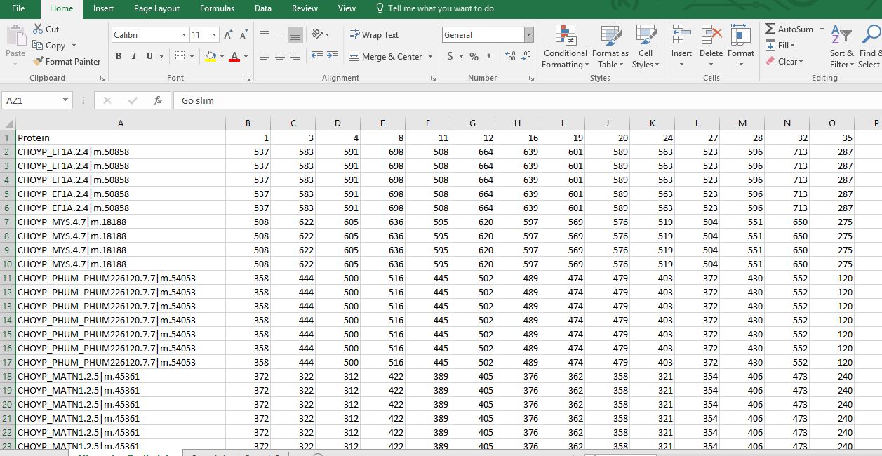
Then I joined this table with the GOtoGOslim table and ended up with this file where I have the CHOYP proteins, NSAF values for all samples, all GO terms, and all GO slim terms.
Yay! Now it’s just a matter of making some visualizations.
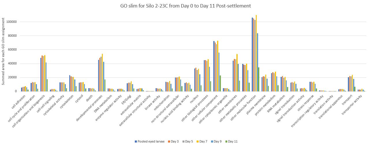
Now that I have this massive table including all of the samples with NSAF values and corresponding GO slim terms I can make some pivot tables and pie charts to visualize resource allocation through larval development.
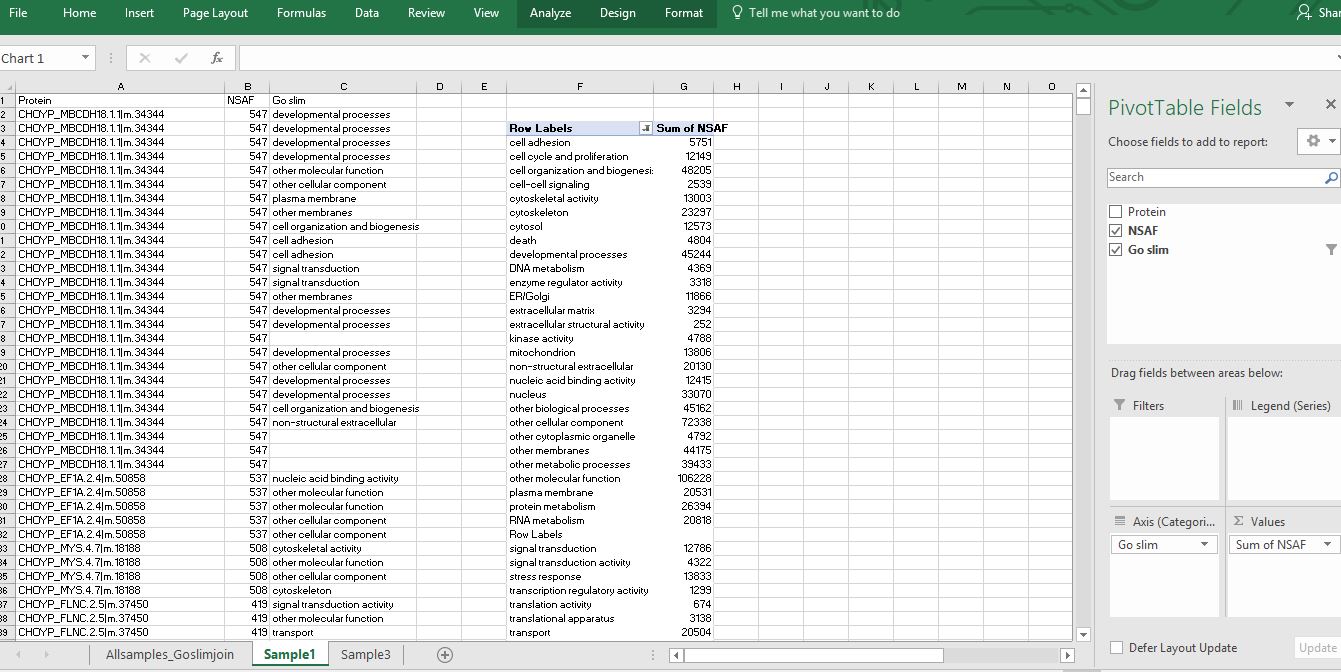
Here is a screenshot of this masterfile
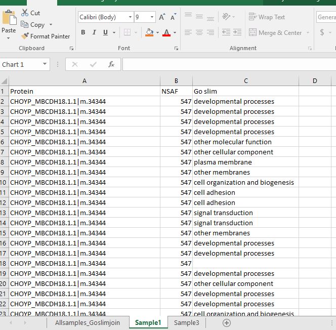
I then copied and pasted the protein names, NSAF values for Sample 1 and the corresponding GO slim term to a new tab.
I then sorted the new worksheet by NSAF values largest to smallest so that I could remove any of the GO slim categories that had a 0 for the NSAF value.
Then I created a Pivot Table by putting the GO slim field into the “Axis” box and the “sum of NSAF” into the values box. For some of the proteins, multiple GO terms were assigned which were categorized into the some of the same GO slim categories (understandably). I am trying to compare expression level of proteins related to certain GO slim categories among my samples. However, I end up summing redundant NSAF values because the same GO slim category pops up multiple times for one protein. I am not sure if what I am doing here makes a ton of logical sense….
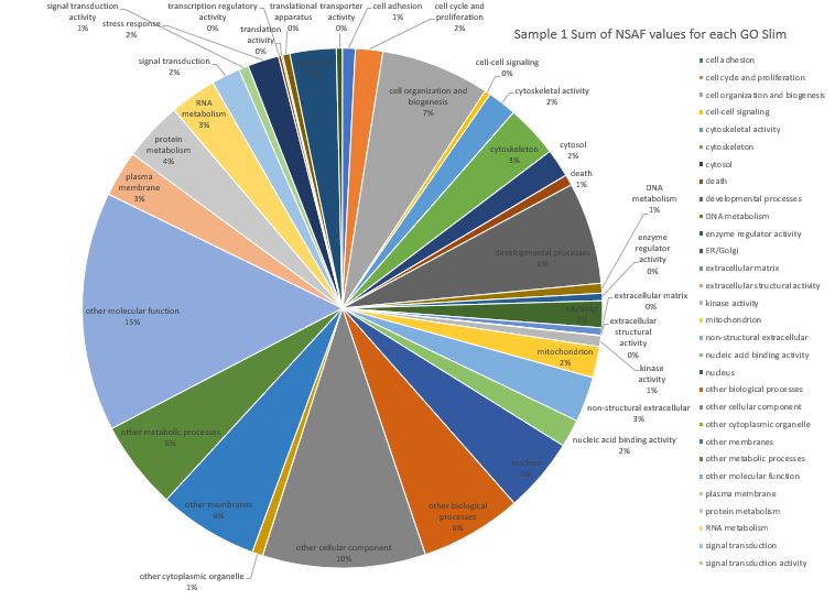
Anyways, I created a pie-chart visualization but since I have 36 Go slim categories it is still pretty overwhelming to look at. There are a total of 38 Go slim categories in this file Here is Sample #1 (pooled competent eyed larvae) where I have summed the NSAF values for each GO slim assignment on a protein. Note: not all the category labels could fit on this chart.
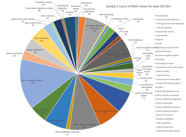
Here is a pie chart where I ignored the NSAF values for the protein and just counted the number of GO slim assignments across all proteins for Sample 1. Note: not all the category labels could fit on this chart.
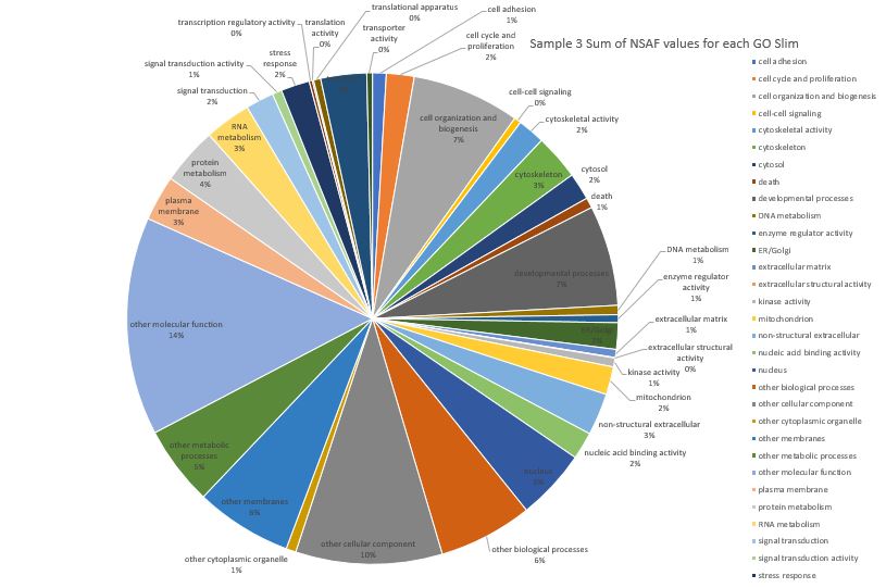
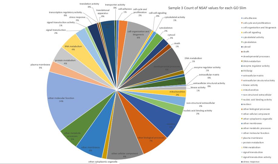
Then I worked on Sample 3 which is from Silo 2-23C at Day 3.
Here is pie chart with summed NSAF values for Sample 3
Here is pie chart with count of NSAF for Sample 3
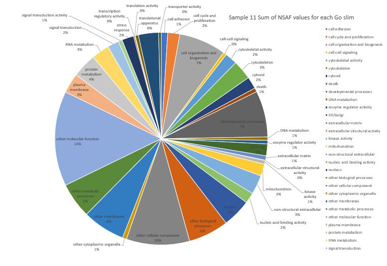
Here is pie chart with summed NSAF values for Sample 11 (Silo 2-23C at Day 5)
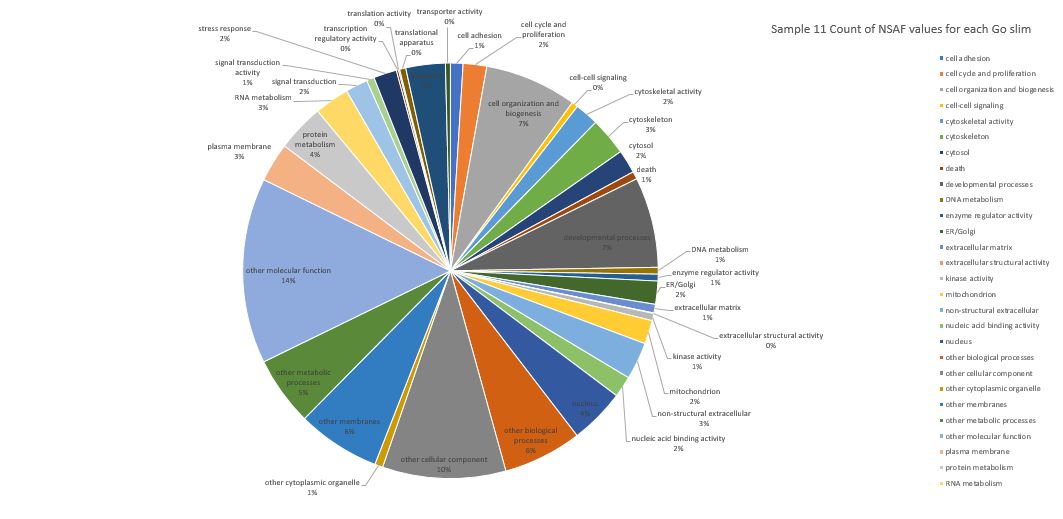
Here is pie chart with count of NSAF for Sample 11
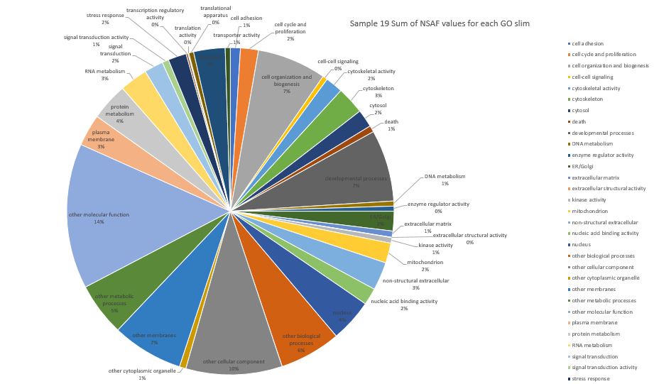
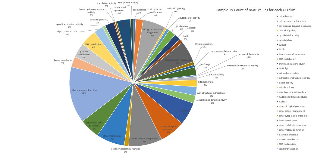
Here is pie chart with summed NSAF values for Sample 19 (Silo 2-23C at Day 7)
Here is pie chart with count of NSAF for Sample 19
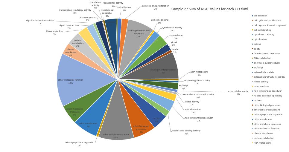
Here is pie chart with summed NSAF values for Sample 27 (Silo 2-23C at Day 9)
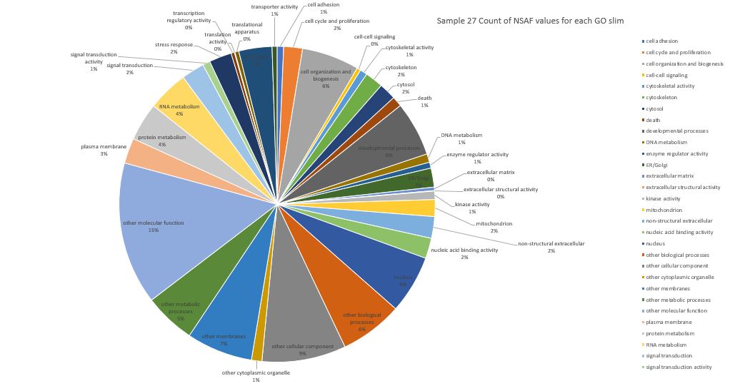
Here is pie chart with count of NSAF for Sample 27
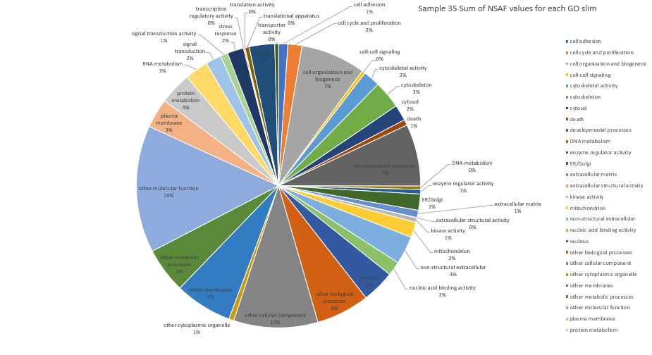
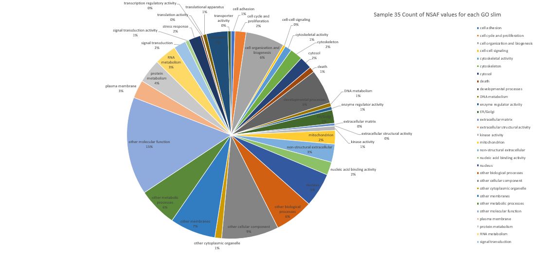
Here is pie chart with summed NSAF values for Sample 35 (Silo 2-23C at Day 11)
Here is pie chart with count of NSAF for Sample 35
And finally to take a step back and look at all days in one graph: