Further exploration of Day 9
05/14/17
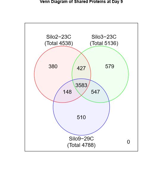
I took lists of the total proteins detected in samples 27, 28 and 32 and imported them into Galaxy to make a Venn diagram of shared proteins at Day 9
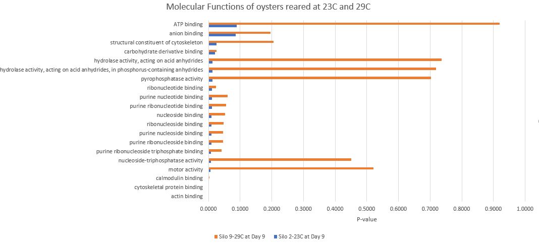
Sample 27: Silo 2-23C at Day 9
Sample 28: Silo 3-23C at Day 9
Sample 32: Silo 9-29C at Day 9
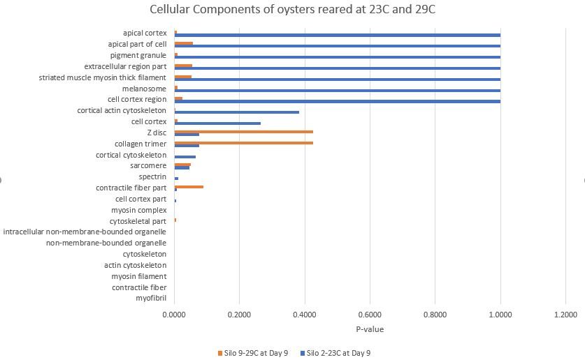
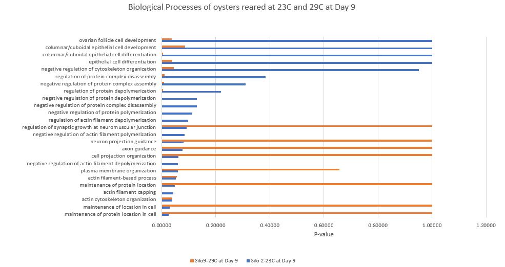
Using the enrichment tool provided by Emma and linked to in previous posts, I created plots in excel. In Box 1 I copied the list of proteins from Sample 27 (Silo 2-23C at Day 9) with an NSAF expression level of at least 100. For Box 2 I copied the list of proteins from Sample 32 (Silo 9-29C at Day 9) with an NSAF expression level of at least 100. I downloaed the report instead of creating visuals this time. This way I am able to make plots in Excel.
Here is a plot for Biological Processes. The X- axis represents P-value so shorter the bar (or lack thereof) the more significant the association is. Orange bars represent Silo 9-29C at Day 9 and blue bars represent Silo 2-23C at Day 9. Output file
And for Molecular Functions and Output file:
And for Cellular Componenets and Output file: